Every Website Copy Section Your Brand Actually Needs
Every Website Copy Section Your Brand Actually Needs

Every effective website runs on multiple key copy sections including a hero with a clear value proposition, services or offerings, benefits, an about page, social proof, calls to action, navigation, header, footer and contact details, resources or portfolio pages, accessibility and SEO fundamentals, and an FAQ. Skip any one of these and you create a gap in the visitor’s path from “who is this?” to “I’m ready to buy.”
Here’s the checklist we hand clients before we write a single word of homepage copy:
- Hero — names the audience and the outcome in one glance
- Services/offerings — what you sell, framed as results
- Benefits — why it matters, not just what it does
- About — brand story that builds trust fast
- Social proof — testimonials, case studies, logos
- CTAs — repeated, specific, low-friction
- Navigation/header — orients visitors in under three seconds
- Footer/contact — answers “how do I reach you” instantly
- Resources/portfolio — proof of craft over time
- Accessibility/SEO — semantic HTML5 elements so screen readers and search engines both find your content
- FAQ — removes last-minute objections
If you’re tracking one number first, watch click-through on your primary CTA before anything else. Time-to-first-click and contact form submissions matter too, but a cold CTA usually means the sections above it aren’t doing their job.
Key Takeaways
Clear, benefit-led copy across eleven core sections, built on semantic HTML5 structure, is what turns a website visitor into a paying client.
| Point | Details |
|---|---|
| Lead with the hero | Name your audience and outcome in the headline; add one proof snippet nearby. |
| Sell benefits, not features | Rewrite each feature as a “so what” statement before it goes live. |
| Place proof at doubt points | Put testimonials and case studies right after claims, not scattered randomly. |
| Use semantic markup | Structure header, nav, main, and footer correctly for accessibility and SEO. |
| Start small with Moderatemurmurations | Moderatemurmurations builds MVP-ready sites with hero, services, proof, and SEO basics handled from day one. |
Table of Contents
- The Website Copy Sections Every Brand Needs, Mapped to the Buyer Journey
- Header and Primary Navigation: What the Copy Must Say
- Hero Copy: Answering Who, What, and Why Now
- Services and Product Pages That Lead With Outcomes
- Benefits Beat Features Every Time
- About Page: Brand Story Without Losing the Offer
- Social Proof: Testimonials, Case Studies, and Logos
- Calls to Action and Microcopy That Reduce Friction
- Contact Page and Footer: Answer the Practical Questions Fast
- Blog, Portfolio, and Work Pages: Long-Form Proof That Converts
- Accessibility, Semantics, and SEO Basics for Your Copy
- How to Roll Out These Sections Without Burning Out
- Common Copy Mistakes That Quietly Kill Conversions
- How Moderatemurmurations Approaches Website Copy Projects
- Privacy Policy and Terms of Use: The Pages Nobody Reads But Everyone Needs
- Customer Support and Live Chat: Where to Put It and What to Say
- Ready to Put These Sections to Work?
- Frequently Asked Questions
- Sources
The Website Copy Sections Every Brand Needs, Mapped to the Buyer Journey
Visitors move through three stages on your site: discovery, consideration, and conversion. Each copy section has one job in that sequence, and confusing the jobs is where most small business homepages break down.
At discovery, your hero and navigation orient a stranger in seconds. At consideration, your services, benefits, and about page qualify and persuade. At conversion, your social proof, CTAs, and contact page close the gap between interest and action.
Here’s how the jobs break down by section:
- Orient — header, navigation, hero headline
- Qualify — services pages, “who this is for” copy
- Persuade — benefits, brand story
- Prove — testimonials, case studies, logos
- Convert — CTAs, contact forms, pricing
- Support — FAQ, footer, customer service details
Consistent copy in your nav and footer does double duty. It helps screen readers and search engines locate your page’s main areas, and it keeps returning visitors from getting lost when they jump between service pages. Treat your header and footer as infrastructure, not afterthoughts.
Header and Primary Navigation: What the Copy Must Say
Your header carries three jobs: brand recognition, wayfinding, and a fast path to conversion. Keep the logo text simple, use plain-language nav labels, and put one utility link (phone number, booking link) where it’s impossible to miss.
Most small business sites do fine with five or six nav items:
- Home
- Services (or “What We Do”)
- Work (or “Portfolio,” “Case Studies”)
- About
- Blog (optional, add once you have 3+ posts)
- Contact
Swap “Services” for something more specific (“Coaching Programs,” “Design Packages”) when your offer needs immediate clarification. A vague nav label forces visitors to click just to figure out what you do, and that’s friction you don’t need.
For accessibility, use a semantic <nav> element, add a skip-to-main-content link for keyboard users, and keep link text descriptive on its own. “Contact us” beats “click here” every time a screen reader parses your links out of context.
Pro Tip: Add your phone number or booking link directly in the header, not just the footer. Visitors ready to act shouldn’t have to scroll to find you.
Hero Copy: Answering Who, What, and Why Now
Your hero is the single highest-leverage section on your site. Visitors decide whether to keep reading within seconds of landing, and that decision rests almost entirely on your headline and subheadline.
Three headline formulas cover most small business situations:
- Outcome + audience: “Clean, Fast Websites for Wellness Brands Ready to Launch”
- Problem + solution: “Stop Losing Clients to a Confusing Website”
- Direct offer: “Custom Websites Built in Days, Not Months”
Your subheadline does one job: add context the headline couldn’t fit, plus one proof point or differentiator. Something like “AI-assisted design, clear messaging, and a launch timeline measured in days” tells a visitor exactly what makes you different without repeating the headline.
CTA labels should match the visitor’s actual intent, not a generic “Learn More.” Try:
- “Book a Free Consult” (high intent, ready to talk)
- “See Pricing” (comparison shopping)
- “Start Free Trial” (product-led businesses)
A short proof snippet belongs in or near the hero. This can be a single stat, a two-sentence testimonial, or a small “as seen in” logo row. Landing page research shows validation works best when it appears immediately after the hook, not buried three scrolls down.
Visual cues need to reinforce, not compete with, your copy. If your headline promises “clean, modern design,” your hero image better show exactly that. A mismatch between what you say and what visitors see reads as inconsistency before they’ve read a second sentence.
Pro Tip: Write five headline variations before picking one. The first version you write is almost always the most generic.
Services and Product Pages That Lead With Outcomes
Service and product copy fails most often when it lists what you do instead of what the client gets. A “web design service” tells a visitor nothing. “A five-page website that’s live in ten business days” tells them everything they need to click.
Use this template for service cards on your homepage or services overview:
- Name: Short, specific (avoid clever branding here)
- One-line outcome: What the client walks away with
- Who it’s for: Name the segment directly
- Time or price cue: Even a range builds trust
- CTA: Specific to that service
Overview pages should stay light: one card per offering, enough detail to help a visitor self-select, and a clear link to the full detail page. Save the deep specifics (process steps, deliverables, FAQs specific to that service) for the detail page itself. Cramming everything onto the overview page overwhelms visitors before they’ve decided which service applies to them.
Naming the segment directly works better than vague inclusivity. “For wellness practitioners launching their first online presence” outperforms “For businesses of all types” because it lets the right visitor recognize themselves immediately.
For SEO, each service page should target one primary keyword phrase in the H1 and title tag, supported by two or three related phrases naturally worked into the body copy. Don’t force it. A page about brand copywriting services can naturally mention “website messaging” and “brand voice guidelines” without stuffing.
Benefits Beat Features Every Time
A feature is what something does. A benefit is why the visitor cares. Most small business copy gets stuck listing features because features are easier to write, but benefits are what actually move people to act.
The formula: feature → so what → benefit. A few quick rewrites:
- Feature: “24/7 customer support chat.” Benefit: “Get answers at midnight when you’re finally free to work on your business.”
- Feature: “Custom color palette matched to your brand.” Benefit: “Look established from day one, not like you’re still figuring things out.”
- Feature: “Mobile-responsive design.” Benefit: “Clients booking from their phone never hit a broken layout.”
Features still matter for technical audiences and pricing pages, where visitors are comparing specs before they buy. Layer features beneath the benefit statement rather than leading with them. Let the benefit make the emotional case, then let the feature back it up with proof.
Microcopy around forms and buttons should carry this same benefit logic. “Takes 2 minutes” next to a form field reduces friction more than any redesign. WordStream’s research on conversion copy points to exactly this: clarity and benefit framing outperform clever wording almost every time.

Pro Tip: If a sentence describes your product, ask “so what?” out loud. Whatever answer comes next is your actual benefit copy.
About Page: Brand Story Without Losing the Offer
An About page that reads like an autobiography loses visitors fast. The job of this page isn’t to tell your whole story. It’s to build enough trust that the visitor moves toward your offer.
A tight structure works best:
- Headline: Not “About Us.” Something that states your stance or mission in one line.
- Why we care: A short paragraph on what drove you to start this
- How we work: A few sentences on your process or approach
- Proof: Years in business, notable clients, credentials
- Next step: A CTA back to your services or contact page
A short story arc connects your origin to the client’s benefit. Something like: “We started building websites because too many good businesses were losing customers to confusing sites. Now we help small businesses launch clean, fast sites in days instead of months.” Two sentences, and the reader understands both the founder motivation and what it means for them.
Credibility snippets should stay short and specific: “5+ years building sites for service providers” beats “years of experience” every time. Specificity signals honesty in a way vague claims never do.
Social Proof: Testimonials, Case Studies, and Logos
Proof elements work best when they show up right where a visitor’s doubt peaks, not scattered randomly across the page. Placing your strongest testimonial right after your hero’s promise, before you’ve made your full case, actually undercuts it. Save proof for right after you’ve made a claim worth backing up.
A testimonial template that works: short quote (one to two sentences), name and title of the person, and the specific outcome they got. “Went from zero online bookings to fifteen a week” carries more weight than “Great service, highly recommend.”
Case studies for service websites don’t need to be long. A four-part structure covers it: challenge (what was broken), approach (what you did), outcome (what changed, with a number if you have one), CTA (link to book a similar project).
Logo bars (“as seen in” or “trusted by”) work well directly under the hero or in a dedicated strip further down the page. Only use logos you have permission to display, and caption them simply, like “Featured in” or “Trusted by teams at.” Placement matters:
- Hero-adjacent: builds immediate credibility
- Features area: reinforces specific claims
- Service pages: validates that exact offer
- Footer: quiet, persistent reassurance
Pro Tip: One detailed case study beats five generic testimonials. Depth signals real results better than volume ever will.
Calls to Action and Microcopy That Reduce Friction
CTA language should match where the visitor is in their decision, not repeat “Learn More” on every single button. Early-stage visitors respond to “See How It Works.” Mid-funnel visitors respond to “Compare Plans.” Ready-to-buy visitors respond to “Book Your Free Consult.”
Form microcopy quietly does a lot of conversion work. A line like “We’ll never share your email” next to a contact form addresses a real hesitation. “Takes less than 2 minutes” sets expectations before someone starts typing. If your form has more than four fields, a simple progress indicator (“Step 1 of 3”) keeps people from abandoning halfway through.
CTA placement checklist:
- In the hero, tied to your main offer
- Right after your benefits section, while the case is fresh
- At the bottom of every page, no exceptions
- A sticky header CTA if your site has long-scrolling pages
Repetition here isn’t redundant. It’s insurance against visitors who scroll past your first ask before they’re ready.
Contact Page and Footer: Answer the Practical Questions Fast
Your contact page should remove every reason someone hesitates to reach out. Include a simple contact form, a direct booking link if you take appointments, your phone number, business hours, and the area you serve if that’s relevant to your business.
Footer copy carries the site’s supporting information: legal links (privacy policy, terms of use), a sitemap, careers if you’re hiring, social links, and a newsletter signup if you run one. Keep this list consistent on every page.
A few lines of microcopy remove real friction:
- “We reply within 1 business day”
- “Prefer to book directly? Grab a time here”
- “Questions? Email us at [address]”
Small reassurances like expected reply time matter more than most business owners assume. Silence after someone fills out a form is one of the fastest ways to lose a warm lead.
Blog, Portfolio, and Work Pages: Long-Form Proof That Converts
Blog posts and portfolio pages aren’t just SEO plays. They’re proof of craft that a two-sentence testimonial can’t match. A well-written case study on your blog shows exactly how you think through a problem, which builds more trust than any claim on your homepage.
Keep portfolio captions specific: client name (if permitted), the challenge, and the result. “Rebuilt a wellness studio’s booking flow, cutting no-shows by simplifying the confirmation email” tells a story in one sentence.
Link your blog posts to relevant service pages, and link service pages back to related blog content. This internal linking pattern helps visitors self-educate before converting, and it gives search engines a clearer map of your site’s structure.
On your homepage, surface this long-form proof through teaser cards or a small “recent work” carousel, rather than dumping the full portfolio front and center. A taste is enough to invite a click.
Accessibility, Semantics, and SEO Basics for Your Copy
Semantic HTML isn’t a developer-only concern. It’s a copy decision too, because how you structure headings and labels directly affects who can actually use your site. Wrap your header content in a <header> tag, your navigation in <nav>, your main content in <main>, and your footer in <footer>. The W3C’s Web Accessibility Initiative confirms this structure helps both assistive technology and search engines locate your page’s core areas reliably.
Meta titles should stay under 60 characters and include your primary keyword near the front. Meta descriptions run 150 to 160 characters and should state a clear benefit, not just a summary. Every page needs exactly one H1, with H2 and H3 tags used in logical order beneath it, not skipped or scrambled for visual effect.
Accessibility copy checklist:
- Alt text on every meaningful image, describing what it shows
- Link text that makes sense without surrounding context (“Book your consult,” not “click here”)
- A skip-to-main-content link near the top of the page
aria-labelattributes on any nonstandard button or icon-only control
Pro Tip: Read your homepage copy out loud with your eyes closed. If a sentence doesn’t make sense without seeing the page, a screen reader user won’t get it either.
Copy and structure work together here, not separately. A gorgeous headline trapped in a <div> soup does search engines and assistive tech users no favors at all.
How to Roll Out These Sections Without Burning Out
Building all eleven sections at once overwhelms most small business owners before they publish anything. A phased approach gets a real site live fast, then improves it.
- Week 1: Nail your messaging and write the hero. Everything else depends on this being right first.
- Week 2: Write services/offerings copy and set up basic SEO (meta titles, one H1 per page, semantic structure).
- Week 3: Add social proof (even one or two testimonials), finalize your header/footer copy, and connect analytics so you can measure what’s working.
Your MVP launch needs: hero, services, contact, basic social proof, header and footer, and meta tags on every page. That’s genuinely enough to go live.
Deprioritize detailed case studies, an extensive FAQ, and a full blog archive until after launch. Add richer proof once you have real client outcomes to reference, and expand your FAQ as actual customer questions start coming in through your contact form.
Common Copy Mistakes That Quietly Kill Conversions
Run a quick audit against these four failure points before you call your copy done:
- Headline names no specific audience or outcome
- No clear “who this is for” language anywhere on the page
- CTA missing from the bottom of a page, or repeated with no variation
- Zero proof elements above the fold
A few before/after fixes:
- Before: “Welcome to Our Website.” After: “Websites Built for Small Businesses, Live in Days.”
- Before: “Contact Us.” After: “Book Your Free Consult.”
- Before: “We offer web design services.” After: “Custom five-page websites, delivered in ten business days.”
Each fix takes one sentence to apply. The pattern is always the same: name the audience, name the outcome, name the next step.
How Moderatemurmurations Approaches Website Copy Projects
Every project starts with discovery: understanding your audience, your offer, and what’s currently confusing visitors on your existing site (or what needs to exist for a first launch). From there, we run a messaging workshop to nail down your core value proposition before a single page gets designed.
Next comes wireframe copy: draft language mapped directly onto the page structure, section by section, so you can see exactly how your hero, services, and CTAs will read together before development starts. Then we build and QA the site, followed by launch and a measurement phase where we track the metrics that actually matter, like CTA click-through and form submissions.
Clients typically see three concrete outcomes: clearer CTAs that visitors actually click, service pages that stop losing people to confusion, and a measurable lift in contact form submissions within the first few weeks post-launch.
- Discovery: audience, offer, and current site gaps
- Messaging workshop: nail the value proposition
- Wireframe copy: section-by-section draft language
- Build and QA: development with copy locked in
- Launch and measurement: track CTA and form performance
Pro Tip: Write your wireframe copy before your designer touches a single layout. Design decisions get much easier when the words already exist.
Privacy Policy and Terms of Use: The Pages Nobody Reads But Everyone Needs
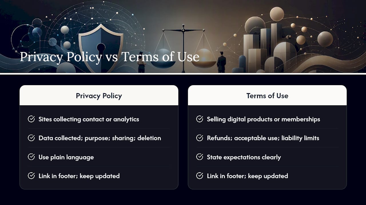
Your privacy policy and terms of use won’t drive conversions, but their absence quietly damages trust and can create real legal exposure depending on what data you collect and where your visitors live. Every site that collects contact form data, email signups, or uses analytics needs a privacy policy stating what you collect and how you use it.
Keep the language plain wherever the law allows it. A privacy policy written entirely in dense legal phrasing signals that you’re hiding something, even when you’re not. State clearly: what data you collect, why you collect it, whether you share it with third parties (email platforms, analytics tools), and how someone can request their data be deleted.
Terms of use matter most if you sell digital products, run a membership, or take payments directly through your site. They set expectations around refunds, acceptable use, and liability limits before a dispute ever happens.
Link both pages from your footer, where visitors expect to find them, and keep them updated as your tools and data practices change. A privacy policy that references a payment processor you stopped using two years ago is a small but real credibility gap. These pages aren’t exciting copy to write, but treating them as an afterthought creates problems that are much harder to fix after the fact than before.
Customer Support and Live Chat: Where to Put It and What to Say
Visitors with a quick question before buying often won’t fill out a full contact form. They want a fast answer, and where you place that option affects whether they stick around long enough to get it.
If you run live chat, make it visible but not obnoxious: a small chat bubble in the bottom corner beats a pop-up that interrupts someone mid-read. Set expectations in the chat greeting itself, giving an idea of typical reply times so visitors aren’t left wondering if anyone’s actually there.
If you don’t have live chat, a clearly stated support email and expected response time cover the same need. Put this information in your footer and on your contact page, not buried three clicks deep. A simple line like “Support questions? Email us at [address], we reply within one business day” does the job without extra tooling.
For service businesses without in-house support staff, a booking link doubles as a support channel. “Have a question before you book? Grab 15 minutes here” turns hesitation into a scheduled conversation instead of an abandoned tab.
Why clarity beats cleverness
Clear copy converts because it removes doubt, and clever copy usually just adds a beat of confusion before the reader figures out what you actually meant.
Ready to Put These Sections to Work?
Reading a checklist and writing eleven sections of tight, benefit-led copy from scratch are two very different projects, especially while you’re also running the actual business. Moderatemurmurations builds AI-assisted websites, landing pages, and brand copy specifically for small businesses, creators, and wellness brands who need this done well and done fast, not stretched across three months of back-and-forth with a traditional agency.
A free consultation is where we map your audience, your offer, and which of these eleven sections need the most work first. From there, most projects move from messaging workshop to a live, launched site in a matter of days, not months, with wireframe copy, accessibility basics, and SEO fundamentals built in from the start. If your current site is missing a clear hero, real social proof, or a CTA that actually gets clicked, start with a free consultation and see what a finished site looks like before you commit to a project.
Frequently Asked Questions
What are the most important website copy sections every brand needs?
The essentials are a hero with a clear value proposition, services or offerings, benefits, an about page, social proof, calls to action, navigation, footer and contact details, and an FAQ. Miss any of these and visitors hit a gap in their decision-making process.
How long should hero copy be?
Keep your headline under 10 words and your subheadline to one clear sentence. The hero’s job is orientation, not explanation. Save details for your services pages.
Do I need a blog if I’m just launching?
Not immediately. Prioritize your hero, services, contact page, and basic proof first. Add a blog once you have three or more posts worth publishing, so the section doesn’t sit empty.
What’s the difference between features and benefits in copy?
A feature describes what your product or service does. A benefit describes why that matters to the client. “24/7 support” is a feature; “get answers at midnight” is the benefit.
How do I know if my copy is working?
Track click-through on your primary CTA, time-to-first-click, and contact form submissions first. These three metrics reveal whether your hero and CTAs are doing their job before you dig into deeper analytics.
Sources
- WAI: Page structure — sections (W3C)
- Structuring documents — MDN Web Docs
- Website copywriting: 17 tips to write copy that converts | WordStream
- Essential Landing Page Sections Every SaaS Needs | Spell UI