The Role of Design in Conversions: A Small Business Guide
The Role of Design in Conversions: A Small Business Guide

Design is the primary driver of website conversions, not a visual afterthought. Every color choice, layout decision, and button placement either moves a visitor toward action or pushes them away. The role of design in conversions is to shape every interaction so that trust builds, friction drops, and the path to “yes” becomes obvious. Research confirms that companies with high design maturity grow at 10% annually versus 3–6% for less mature competitors. That gap is not a coincidence. It is the compounding result of better decisions made at every visual touchpoint.
How does design influence buying decisions and conversion rates?
Conversion design is defined as the practice of making every visual decision serve one goal: driving the visitor to take a specific action. Conversion design is not about aesthetics. It is about clarity, trust, and reducing the mental effort required to say yes.
Visual hierarchy does most of the work
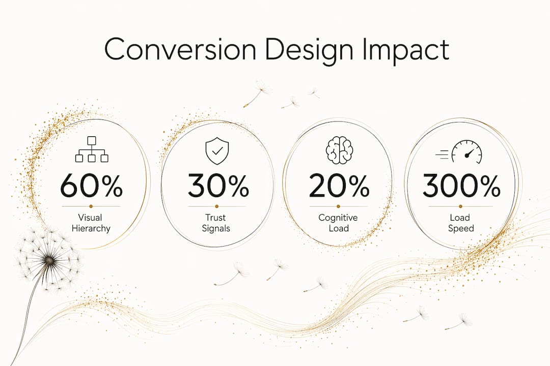
Visual hierarchy drives over 60% of conversion performance differences by guiding user attention in a predictable sequence. That means your headline, subheadline, benefits, and call to action need to appear in the right order, at the right size, with the right contrast. When a visitor lands on your page, their eye follows a path. If that path leads to confusion, they leave. If it leads to clarity, they convert.

The average website converts at 2.35%. The top 10% of websites convert at 11.45% or higher. The difference is almost entirely explained by superior design decisions, not better products or lower prices.
Trust signals and cognitive load
Trust signals are the second major lever. User reviews, money-back guarantees, and clear product information are fundamental to landing page effectiveness across all demographics. Interestingly, visual trust cues outperform personalized AI recommendations in landing page performance. Basic credibility elements still win.
Cognitive load is the third factor. When a page presents too many choices or too much text, visitors freeze and leave. Progressive disclosure, which means revealing information in stages rather than all at once, reduces hesitation early in the funnel. Fewer decisions presented at once means more decisions completed.
Speed is part of the design equation
Page load speed is a design decision, not just a technical one. Sites loading in one second convert three times higher than those loading in five seconds. Every 100 milliseconds shaved off load time correlates with a 1.11% conversion increase. If your site is slow, your design is broken, regardless of how it looks.
Pro Tip: Test your page speed with Google PageSpeed Insights before making any visual design changes. A fast, plain page outperforms a slow, beautiful one every time.
What design strategies actually improve conversions?
The most effective design strategies for conversion share one trait: they reduce the number of decisions a visitor has to make. Here is a numbered framework you can apply to any page on your site.
-
One page, one goal. Every page should have a single primary call to action. Cluttering pages with multiple CTAs increases cognitive load and raises bounce rates. Pick one action per page and design everything around it.
-
Use whitespace deliberately. Whitespace is not empty space. It is a design tool that directs attention toward what matters. Crowded pages feel untrustworthy. Clean pages feel confident.
-
Follow a natural content flow. Structure every page in this sequence: headline, key benefit, call to action, trust signals. This mirrors how visitors naturally scan a page and reduces the effort needed to understand your offer.
-
Eliminate navigation clutter on landing pages. Navigation menus give visitors an exit. On a dedicated landing page, remove the top navigation entirely. Keep the visitor focused on the one action you want them to take.
-
Apply brand identity consistently. Consistent use of color, typography, and tone builds recognition and trust across every page. Inconsistency signals amateur execution and erodes confidence before a visitor even reads your copy.
For small business owners building their online presence for conversions, these five principles form the foundation of every high-performing page.
Pro Tip: Map your visual hierarchy on paper before you open any design tool. Decide the order of attention before you decide the colors.
Are there common misconceptions about design and conversions?
The most damaging misconception is that design is decoration. Business owners treat it as the last step, something to polish after the “real work” is done. That framing costs real money.
Design that organizes your offer, simplifies decisions, and builds trust is the cheapest element in your revenue chain with the highest impact. Poor design does not just look bad. It creates margin losses that are nearly impossible to measure because you never see the customers who left without converting.
The second misconception is that A/B testing fixes design problems. It does not. Conversion rate optimization should start with a clear, trustworthy, and easy-to-use design foundation before A/B testing becomes useful. Running split tests on a confusing page only tells you which version of confusing performs slightly less badly.
“Design maturity correlates directly with business growth and profitability. Companies that treat design as a strategic function, not a cosmetic one, grow faster, retain more customers, and protect their margins better than those that treat it as an afterthought.”
The third misconception is that good design is expensive. The real cost is the revenue lost to poor design. A McKinsey analysis found that high design maturity produces an 11% profit increase over less design-mature competitors. That is a return that most marketing channels cannot match.
- Design is not a cost center. It is a revenue function.
- A/B testing works on a solid foundation. It cannot build one.
- Trust signals matter more than visual flair.
- Slow load times are a design failure, not just a technical one.
- Inconsistent branding destroys the trust that good copy builds.
How do you measure and improve design’s impact over time?
Improving design impact requires a structured process, not guesswork. Use this sequence to build a measurement practice that actually changes outcomes.
-
Audit your user flow first. Use analytics to identify where visitors drop off. Google Analytics 4 and Microsoft Clarity both show scroll depth and click patterns. Drop-off points reveal design failures, not content failures.
-
Map visual hierarchy before wireframing. Plan the order of attention before you design anything. Decide what the visitor sees first, second, and third. Conversion-focused design baked into wireframing yields far better results than retrofitting aesthetics later.
-
Apply progressive disclosure. Break complex offers into stages. Show the headline and primary benefit first. Reveal pricing, details, and FAQs only after the visitor has engaged. This reduces early-funnel hesitation and keeps visitors moving forward.
-
Run A/B tests only after the foundation is solid. Once your page has clear hierarchy, fast load times, and strong trust signals, test one variable at a time. Button color, headline phrasing, and CTA placement are all valid test variables on a well-structured page.
-
Track conversion rate by page, not just site-wide. Site-wide conversion rates hide which pages are underperforming. Segment by page type: landing pages, product pages, and contact pages each have different benchmarks and different design levers.
For service businesses, the consultant website conversion guide covers page-specific design decisions that move visitors from interest to inquiry.
| Design action | Conversion impact |
|---|---|
| Single CTA per page | Reduces bounce, increases focus |
| Load time under 1 second | Up to 3x higher conversion rate |
| Trust signals above the fold | Improves landing page effectiveness |
| Visual hierarchy planning | Accounts for 60%+ of conversion differences |
| Progressive disclosure | Reduces early-funnel drop-off |
Key Takeaways
Conversion design is the single most cost-effective growth lever available to small businesses, directly determining whether visitors trust, engage, and buy.
| Point | Details |
|---|---|
| Design drives revenue | High design maturity produces 10% annual growth versus 3–6% for less mature competitors. |
| Visual hierarchy is critical | It accounts for over 60% of conversion performance differences across pages. |
| Speed is a design decision | Pages loading in one second convert three times higher than those loading in five seconds. |
| A/B testing needs a foundation | Run split tests only after your page has clear hierarchy, trust signals, and fast load times. |
| One page, one goal | Removing extra CTAs and navigation clutter reduces cognitive load and increases conversions. |
Why design is the growth lever most small businesses ignore
I have worked with dozens of small business owners who spent thousands on ads and almost nothing on the pages those ads sent traffic to. The pattern is consistent. They treat design as a one-time setup task rather than an ongoing business function. The ads get optimized weekly. The landing page gets touched once a year.
The uncomfortable truth is that design decisions made in the first week of a website build determine the ceiling for every marketing dollar spent afterward. A well-structured page with clear hierarchy and fast load times will outperform a beautiful but cluttered page in every test I have seen. The businesses that grow fastest are not the ones with the biggest budgets. They are the ones that treat design as a strategic function from day one.
Start with your most important page, usually your homepage or primary landing page. Map the visual hierarchy on paper. Identify every exit point that is not your primary CTA. Remove them. Add one trust signal above the fold. Measure the result. That single process, repeated across your site, compounds into a meaningful conversion lift over time. Design is not magic. It is method.
— Christopher
How Moderatemurmurations builds conversion-ready websites for small businesses
Moderatemurmurations builds fast, clean websites and landing pages designed from the ground up to convert visitors into customers.
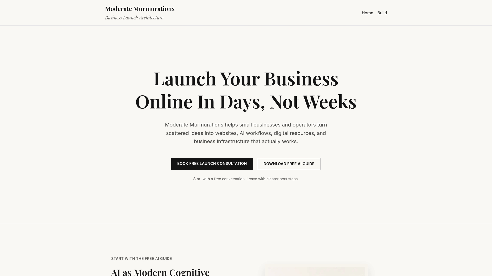
Every site we build starts with visual hierarchy planning, clear messaging, and a single conversion goal per page. We integrate AI workflows and automation that reduce friction across the user experience, from contact forms to follow-up sequences. If your current site is not converting at the rate your traffic deserves, the issue is almost always structural, not cosmetic. Visit Moderatemurmurations to see how we help small businesses build a polished, conversion-focused online presence quickly and without the confusion.
FAQ
What is conversion design?
Conversion design is the practice of making every visual decision serve one goal: driving a specific visitor action. It prioritizes clarity, trust, and reduced friction over aesthetics alone.
How much does design affect conversion rates?
The average website converts at 2.35%, while the top 10% convert at 11.45% or higher. The primary difference is the quality of design decisions, particularly visual hierarchy and trust signals.
Should I A/B test my website design?
A/B testing works best on a well-structured, trustworthy design foundation. Running tests on a poorly designed page only identifies which version of a flawed experience performs slightly better.
What is the single most important design change for conversions?
Adopting a one-page, one-goal structure with a single primary call to action reduces cognitive load and is consistently the highest-impact design change for small business websites.
How does page speed relate to design?
Page load speed is a design decision. Sites that load in one second convert three times higher than those loading in five seconds, making performance a core part of any conversion-focused design process.