Win the First 3 Seconds: Hero Section Examples and Copy First Patterns
Win the First 3 Seconds: Hero Section Examples and Copy First Patterns

The strongest hero section examples all do one job well: they tell a visitor what this is, who it’s for, and why it matters, in the three seconds before they scroll or bounce. This roundup gathers standout heroes from Notion, Webflow, Allbirds, and other brands worth studying, then breaks down the copy formulas, layout choices, and performance habits behind them. We build hero sections for a living at Moderatemurmurations, so what follows is a practical shortlist, not a mood board.
TL;DR:
- Using a static image hero with clear, benefit-driven headlines generally outperforms video backgrounds or carousels, especially for small budgets.
- Avoid over-promising with vague claims and ensure your visuals directly illustrate the headline’s promise to enhance clarity and trust.
- Prioritize fast loading by compressing images, deferring heavy media, and designing for mobile responsiveness to prevent slow load times and layout shifts.
- Test hero effectiveness through metrics like click rates, scroll depth, and simple five-second viewer tests, then refine based on data.
- Focus your hero on one core idea, and ensure the heading, visual, and CTA work together to deliver a clear, honest message before moving to design or development.
Table of Contents
- Hero Section Examples Worth Studying by Category
- Which Hero Type Fits Your Site?
- Writing Headlines, Subheadings, and CTAs That Work
- Keeping Hero Sections Fast and Accessible
- How to Test a Hero Section Before You Commit
- How Moderate Murmurations Builds a Hero Section
- Ready to Build Your Own High-Converting Hero?
- Three Mistakes and Three Rules for Better Hero Sections
- Where to Find More Hero Section Inspiration
- Sources
Hero Section Examples Worth Studying by Category
A hero is the prominent visual block above the fold, and it should communicate one focused idea rather than five competing ones, according to Prismic’s breakdown of hero section best practices. The examples below prove that rule holds across wildly different industries.
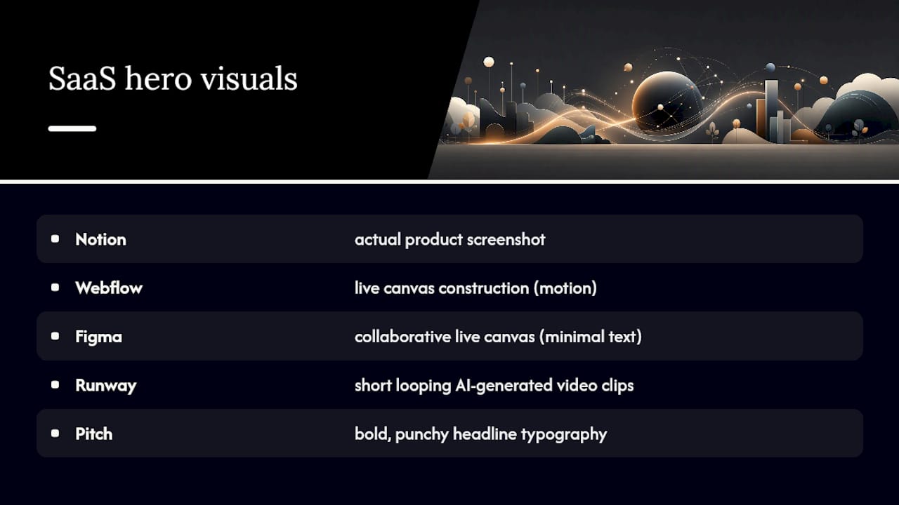
SaaS and productivity tools. Notion pairs a plain-language headline with a screenshot of its actual product, letting the interface do the convincing instead of stock photography. Webflow leans on motion, showing a canvas being built in real time to prove the “design freedom” claim rather than just stating it. Figma keeps its hero almost text-free, using a live collaborative canvas as the visual so the product demonstrates itself. Runway uses short looping video clips of AI-generated footage, a smart move since its entire pitch is about what the tool can create. Pitch opts for a bold, punchy headline over a colorful gradient background, signaling personality before feature lists.
E-commerce. Allbirds photographs its shoes on real feet in natural light, which reinforces the brand’s sustainability story better than a studio shot ever could. Truff uses moody, high-contrast product photography that makes a truffle hot sauce look like a luxury item, a deliberate positioning choice.
Creators and personal brands. Josh Comeau’s site opens with playful, hand-drawn illustration and a conversational headline that mirrors his teaching voice. Meg Lewis uses saturated color and oversized type to make her hero feel like a piece of art rather than a business card.
Mission-driven organizations. The Ocean Cleanup uses drone footage of its actual cleanup vessels, turning an abstract cause into something visitors can see working. Every.org keeps its hero simple: one clear statement of purpose and a single donation CTA, avoiding the trap of over-explaining the mission before asking for action.
Curated galleries like these consistently show that categorized examples with a short “why it works” note teach more than generic templates, a pattern DreamHost’s hero section roundup also leans on. For image placeholders, plan on a 1,920 by 1,080 pixel hero image with the focal subject centered in the top two thirds, since CTAs and headlines usually sit lower on mobile crops.
Which Hero Type Fits Your Site?
Hero formats break down into a handful of proven types, and each one trades visual punch for production cost differently, per Squarespace’s guide to hero image design.
- Static image hero: one strong photo or illustration behind the headline; cheapest to build, fastest to load, and still the safest default for most small business sites.
- Full-bleed background: an image or color field that stretches edge to edge; great for brand mood but needs careful text contrast.
- Video background: short looping clips that add energy, best for product demos or lifestyle brands, but the heaviest on page weight and mobile data.
- Animated or interactive hero: scroll-triggered motion or a live canvas like Figma’s; memorable, but requires real front-end development time.
- Carousel: rotating slides for multiple messages; tends to hurt conversion because visitors rarely wait for slide two.
- Product-first hero: the product or interface itself is the visual, as Notion and Figma both use.
If your team is short on production budget, a static image with sharp copy usually outperforms a half-finished video background. Simple often wins.
Writing Headlines, Subheadings, and CTAs That Work
Copy carries more weight than visuals in most hero sections, and a headline that leads with a clear outcome beats a clever-but-vague one for conversion, according to Prismic’s research on hero copy. Use these formulas as starting points:
- Benefit-first: “Write less, ship faster.” Leads with the payoff.
- Outcome-first: “Your team’s whole workflow, in one workspace.” Notion, Figma, and Ahrefs all lean on this pattern, pairing a plain outcome statement with a product visual instead of a slogan, as noted in DreamHost’s hero examples.
- Persona-first: “Built for freelancers who hate spreadsheets.” Names the visitor directly.
Subheadings should run one sentence, roughly 10 to 18 words, and answer the “how” the headline leaves open. CTAs work best when the primary button uses an action verb tied to the outcome (“Start free trial”) rather than a vague “Learn more,” and a secondary link (a demo video or pricing page) should stay visually quieter than the primary button.
Visuals should illustrate the headline’s claim, not distract from it. If the copy promises speed, show speed, not an unrelated lifestyle photo.
Pro Tip: Read your headline out loud without the subheading. If it doesn’t make sense alone, it’s too clever and not clear enough.
Keeping Hero Sections Fast and Accessible
A beautiful hero that loads slowly or locks out keyboard users fails before it converts anyone. Build with this checklist in mind:
- Compress hero images to modern formats like WebP or AVIF, and keep file sizes under roughly 200KB where possible.
- Prioritize the headline text and CTA in the critical rendering path, deferring heavy video or animation so layout doesn’t shift after load, a technique detailed in Prismic’s production guidance.
- Use responsive source sets so mobile devices don’t download a desktop-sized image, and design breakpoints that preserve headline hierarchy on small screens, per Squarespace’s sizing guide.
- Check text contrast against the background, make the CTA button keyboard focusable, write real alt text for hero images, and caption any hero video.
- Confirm the visible hero headline is marked up as an H1 or otherwise carries proper semantic structure, which also supports SEO fundamentals for service providers.
How to Test a Hero Section Before You Commit
A hero design is a hypothesis, not a finished decision. Track these before locking anything in:
- Measure CTA click rate, scroll depth, bounce rate, and downstream conversions as your core metrics.
- Run simple A/B tests: swap the headline wording, compare a product screenshot against a lifestyle photo, or test two CTA labels against each other.
- Run a 5-second test with a few outside viewers and ask what they think the site offers.
- Sample session replays to see where attention drops before the fold.
- Review results every two to four weeks, and only ship a change once one variant clearly outperforms the other across a full traffic cycle.
How Moderate Murmurations Builds a Hero Section
Our process starts with discovery, then message-first copy before any visual work begins, because a headline that doesn’t know its audience can’t be rescued by good design. From there we set visual direction, move into lightweight production, and run performance checks before launch. Clients typically see faster launch times and clearer above-the-fold messaging than they had with a template.
For service businesses specifically, hero patterns that name the outcome and audience directly tend to outperform vague taglines, a pattern we’ve also seen work well in consultant website conversions and in local business homepage copy.
Ready to Build Your Own High-Converting Hero?
You’ve seen what works across a dozen industries. Turning that inspiration into a hero section that actually performs on your site is where most teams stall out, usually because copy, design, and development get handled by three different people who never quite agree on the message. If you’d rather skip that friction, Moderatemurmurations builds message-first websites and hero sections for small businesses, creators, and service providers, starting with a free consultation to map out what your homepage actually needs to say. Book a call and we’ll help you turn a blank hero section into your best-performing page.
Three Mistakes and Three Rules for Better Hero Sections
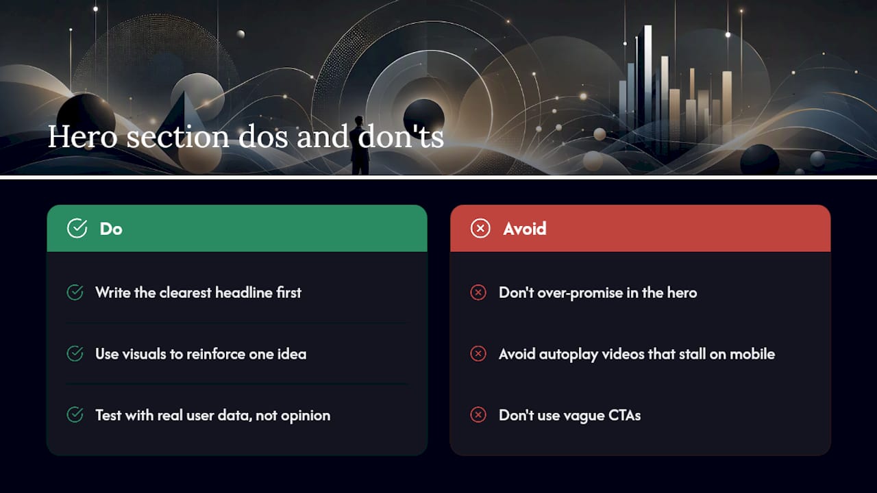
The mistake we see most often is a hero that over-promises: bold claims the rest of the site can’t back up, which breaks trust the moment a visitor scrolls further. Close behind it are heavy autoplay videos that stall on mobile, and CTAs so vague nobody knows what happens after the click.
Three rules hold up regardless of industry: write the clearest possible headline before touching design, let the visual reinforce one idea instead of five, and test with real data instead of internal opinion. A hero should open the conversation, not try to close the sale in one screen, a distinction worth remembering before you add another badge or banner to the top of your homepage. Keep the promise in the hero honest, and let the rest of the site earn the follow-through.
— Christopher
Where to Find More Hero Section Inspiration
For deeper research beyond this roundup, a handful of sources consistently deliver strong, well-organized examples. Prismic’s hero section guide covers best practices and structural breakdowns in detail. DreamHost’s homepage hero roundup collects real examples across industries with short explanations of why each one works. Squarespace’s hero image guide focuses on sizing, formats, and technical image decisions. Webflow’s Made in Webflow gallery offers cloneable hero templates built by real designers. Justinmind and Dribbble round out the list with wireframe-level layout ideas and pure visual inspiration, useful once you’ve settled on the message and need to explore form.
Sources
- Website Hero Section Best Practices + Examples: A Complete Guide
- 12 Real Hero Section Examples That Get It Right
- Website Hero Images: Sizes, Examples, and Design Tips — Squarespace
- Browse made-in-Webflow hero examples