15 Consultant Portfolio Website Examples With Copyable Case Studies
15 Consultant Portfolio Website Examples With Copyable Case Studies

Prioritize one thing above everything else: a niche-focused case study that proves a measurable outcome, paired with a clear, low-friction way to book you. Build that first. A specialty headline, one result-driven proof point, and a single booking CTA will out-convert a beautifully designed homepage with none of the three. Everything else, including examples, page structure, and platform choice, builds around that core.
TL;DR:
- A niche-focused case study with measurable results and a clear booking call-to-action is more effective than a polished homepage without a proven outcome.
- Displaying one strong, outcome-driven case study above the fold, with results in metrics and a client quote, significantly boosts credibility and conversion.
- A simple, outcome-oriented messaging structure, mobile-optimized design, and a booking flow with two clicks or fewer maximize lead capture.
- Using a platform tailored to your budget and skill level, such as visual builders, Webflow, or WordPress, ensures quick deployment and functional flexibility.
- Building case studies from actual client work in a straightforward format, with permission and specific metrics, offers the greatest trust and sales potential.
Table of Contents
- What Every Great Consultant Portfolio Website Gets Right
- 15 Consultant Portfolio Website Examples Worth Studying
- The Anatomy of a High-Converting Consultant Site
- Choosing the Right Platform for Your Budget and Skill Level
- How to Turn a Client Engagement Into a Case Study That Sells
- Protecting Client Trust: Security and Privacy on Your Site
- Should You Add a Blog or Thought Leadership Content?
- A Practical Take: What Actually Moves the Needle
- Launch a Booking-Ready Portfolio Site Without the DIY Grind
- Where to Find More Consultant Site Examples and Tools
- Sources
What Every Great Consultant Portfolio Website Gets Right
Before you touch a template or write a single page, borrow these patterns. Each one shows up again and again across the strongest consultant sites, and each is small enough to implement in an afternoon.
- Headline formula that names the niche and the outcome. “I help SaaS founders cut churn” beats “Strategy Consultant” every time.
- One featured case study above the fold. Not a client logo wall. An actual before-and-after story with a number attached.
- Services written as outcomes, not tasks. “Reduce onboarding drop-off” reads better than “Onboarding audits.”
- A booking flow with two clicks or fewer, plus a testimonial or client logo sitting right next to the CTA.
- Mobile-first layout and fast load times, since most first visits now happen on a phone screen, often from a LinkedIn link.
That last point matters more than most consultants assume. B2B consultants who focus their energy on one platform like LinkedIn paired with a simple, booking-ready site tend to convert leads faster than those spreading thin across five channels. A minimal landing page with a clear CTA is often enough to start; you can add polish once you know which message actually lands with prospects.
Pro Tip: Screenshot your homepage on your phone right now. If you have to scroll past a hero image and a mission statement before seeing what you actually do for clients, that’s the first fix.
15 Consultant Portfolio Website Examples Worth Studying
These examples span different specialties, price points, and design sensibilities. Some are polished agency-style sites; others are lean, one-page landing pages that do their job without any unnecessary flourish. Pull one takeaway from each and apply it to your own site this week.
1. The Outcome-First Homepage
Some of the strongest consultant sites open with a single sentence that reads almost like a proposal: who they help, what changes, and proof it worked. No stock photography of handshakes, no vague mission paragraph. Takeaway: Write your homepage’s first sentence as if it were the opening line of a client pitch, not a bio.
2. The Single Case Study Hero Section
A number of financial and operations consultants build their entire homepage around one detailed case study, complete with a before metric, an after metric, and a short quote. Nothing else competes for attention above the fold. Takeaway: Pick your best result and let it carry the whole top third of your page.

3. The Specialist Landing Page
Lean, single-scroll sites built by niche consultants (supply chain, HR compliance, nonprofit fundraising) often skip a full site entirely. One page: headline, three services, one case study, a calendar embed. Takeaway: If you serve a narrow niche, resist the urge to build five pages you don’t need yet.
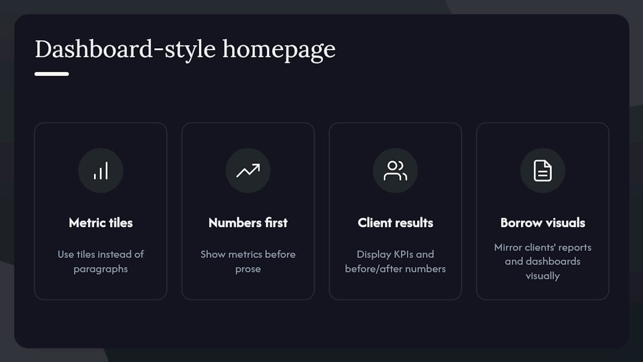
4. The Data-Driven Dashboard Look
Analytics and BI consultants sometimes design their site to mimic a dashboard, with metric tiles instead of paragraphs. Visitors see numbers first, prose second. Takeaway: If your work produces dashboards or reports for clients, let your site borrow that visual language.
5. The Personal Brand Blog Hub
Some independent strategists structure their site around a blog that functions as ongoing proof of expertise, with the portfolio and booking CTA folded into the sidebar and footer. Takeaway: If you publish often, let the writing do double duty as both marketing and credibility.
6. The Video Testimonial Homepage
A handful of executive coaches and leadership consultants lead with a 30 to 60 second client video instead of text, placed directly under the headline. Takeaway: A short video testimonial often builds trust faster than a written quote, especially for high-ticket engagements.
7. The Comparison Table Pricing Page
Management and IT consultants occasionally lay out their service tiers in a simple three-column table (Starter, Growth, Enterprise) rather than forcing every prospect into a discovery call just to learn the price range. Takeaway: Even rough pricing bands reduce friction for prospects who are still comparing options.
8. The Founder Story About Page
Rather than a generic bio, some consultants build their About page around the specific problem that led them to start consulting, tied directly to the kind of client they now serve. Takeaway: Your origin story only earns its place on the page if it explains why you’re credible for this niche.
9. The Modular Case Study Library
Larger advisory practices sometimes build a dedicated case studies section with filters by industry or service type, letting a prospect self-select the most relevant proof. Takeaway: If you have five or more case studies, organize them by industry so visitors find relevant proof fast.
10. The Minimalist One-Pager With Embedded Calendar
Several freelance consultants strip everything down to headline, three bullet outcomes, and an embedded Calendly widget with no separate contact page at all. Takeaway: Fewer clicks between “interested” and “booked” almost always beats more content.
11. The Thought Leadership Homepage
Some consultants, particularly in policy and research fields, use their homepage to spotlight recent speaking engagements, publications, and media mentions ahead of any service description. Takeaway: If your authority comes from public visibility, feature it prominently rather than burying it on a separate press page.
12. The Interactive Assessment Funnel
A few marketing and operations consultants replace a plain contact form with a short interactive quiz (“What’s slowing your growth?”) that routes to a tailored results page and CTA. Takeaway: An assessment tool can qualify leads and demonstrate expertise in the same three minutes.
13. The Editorial-Style Portfolio
Design-savvy consultants sometimes build sites that read more like a magazine feature than a sales page: generous whitespace, serif type, long-form case narratives. Design galleries like Awwwards’s portfolio collection are full of this approach. Takeaway: If your niche rewards taste and craft (branding, design, architecture consulting), let your layout signal that directly.
14. The Results Timeline Case Study
Some operations and turnaround consultants format their case studies as a literal timeline, month by month, showing the metric moving in the right direction over a defined period. Takeaway: A timeline format makes a slow-building result feel more credible than a single before/after snapshot.
15. The Team-of-One Enterprise Look
A number of solo consultants who work with enterprise clients deliberately build sites that look like a small firm, complete with a services grid and process diagram, to match the expectations of corporate buyers. Takeaway: Match your site’s visual formality to the size and expectations of your ideal client, not to your actual headcount.
The Anatomy of a High-Converting Consultant Site
A consultant portfolio website needs a small, deliberate set of pages, and each one has exactly one job.
- Homepage: State your niche, your outcome, and your proof in the first screen. One CTA, repeated once more near the bottom.
- Services: Describe each offering as a result the client gets, not a task you perform.
- Case studies: Detail three to six of your strongest engagements, each following the same format.
- About: Explain why you’re credible for this specific niche, not your entire career history.
- Contact/schedule: Make booking a call the single easiest action on the entire site.
For copy, a reliable headline formula is: [Who you help] + [outcome you deliver] + [how you’re different]. Your one-line value proposition should answer “why you, not the next consultant” in under 15 words. Write each service as an outcome sentence: “You’ll cut reporting time by half,” not “I build reporting dashboards.”
Showing results credibly means naming the actual metric, the timeframe it happened in, and, wherever you have permission, a direct client quote attached to that number. Vague claims like “significant growth” do more harm than good, since specificity is what makes a claim believable in the first place. Design collections built around narrative case studies consistently show that a clear before-to-after story, not decorative visuals, is what actually persuades a skeptical prospect.
On booking UX, keep your CTA language specific (“Book a 20 minute fit call,” not “Get in touch”), use a scheduling widget instead of a bare contact form when you can, and set expectations for response time directly on the page. Your SEO checklist for service providers should include one page per core niche or service, basic schema markup for your business, and internal links connecting your case studies to your services pages.
Pro Tip: Read every “outcome” sentence on your services page out loud. If it starts with “I,” rewrite it to start with “You.”
Choosing the Right Platform for Your Budget and Skill Level
The platform decision should follow your timeline, not the other way around.
- Fast launch, limited budget: A visual builder with a premium template gets you live in days, and suits consultants who need a booking-ready site now rather than a perfectly custom one.
- Design control, higher budget: Webflow or custom code fit consultants whose visual presentation is itself part of the pitch, such as branding or UX consultants.
- Content scale over time: WordPress with a simple, well-supported theme works best if you plan to publish regularly and need a CMS built for volume.
Whatever you choose, check for four things before committing to any template: a case study layout that reads well on mobile, native or plugin-based CMS support for adding new work, a straightforward way to embed a scheduling tool, and a clean loading speed score out of the box. Example collections often note the platform behind each site for exactly this reason: knowing that a design was built in a specific tool tells you how realistic it is for your own skill level.
How to Turn a Client Engagement Into a Case Study That Sells
Most consultants sit on case-study-worthy work and never write it up. Fix that with a repeatable six-part structure:
- Context — the client’s industry and size, stated briefly.
- Client profile — who they were and what stage of business they were in.
- Challenge — the specific problem, described the way the client would describe it.
- Approach — what you actually did, in plain language.
- Measurable result — the number, the percentage, or the dollar figure, with a timeframe attached.
- Testimonial — a direct quote, ideally tied to that same result.
Always ask permission before publishing client details, and offer to anonymize the company name or round sensitive numbers if they’re hesitant. A vague “a mid-sized logistics firm” with a real number attached still reads as credible.
For formatting, pull the single strongest metric into a large “hero” number at the top of the case study, use a pull quote to break up the narrative, and add a before/after visual if your work produces one (a dashboard, a report, a redesigned process map). Keep a short version, three to four sentences, for your homepage, and save the full version for a dedicated case studies page.
Pro Tip: If a client won’t approve a public case study, ask for a private, name-redacted version you can send by email to serious prospects instead. Half the value comes from the specificity, not the public visibility.

Protecting Client Trust: Security and Privacy on Your Site
A consultant’s website often handles more sensitive information than it looks like on the surface. Contact forms collect names, emails, and sometimes budget details. Scheduling tools store calendar data. If you host any client documents or portals, that’s a genuine liability if mishandled.
Start with the basics: an SSL certificate (the padlock icon and “https” in the address bar) is non-negotiable, and most modern builders and hosts include it by default now. Use a reputable form provider or scheduling tool rather than a bare custom form, since those services typically handle spam filtering and data storage more securely than a homemade solution.
If you publish case studies with real client names, numbers, or quotes, get written permission and state clearly, even briefly, how you handle any data submitted through your contact or intake forms. A short privacy note near your contact form, even one sentence, signals to a cautious enterprise buyer that you take confidentiality seriously, which matters more in consulting than in almost any other service category.
Keep your CMS and any plugins updated, since outdated software is the most common way small business sites get compromised. If you use a third-party scheduling widget or payment processor, confirm they carry their own security certifications rather than assuming your site’s security automatically extends to embedded tools. None of this needs to be complicated. It just needs to not be ignored.
Should You Add a Blog or Thought Leadership Content?
Blogging works for consultants when it’s used to demonstrate a specific point of view, not to chase generic search traffic. A short, sharp post about a mistake you see clients make repeatedly does more for your credibility than a broad “10 tips” roundup that could have been written by anyone.
The strongest use of a blog on a consultant portfolio site is as supporting evidence for your case studies, not a replacement for them. Write about the reasoning behind a decision you made with a client, the framework you used, or a trend you’re seeing across engagements. That kind of writing gives prospects a preview of how you think, which is often exactly what they’re buying.
If you don’t have time to publish weekly, don’t. A handful of substantial, specific posts published a few times a year outperforms a thin, frequent stream of generic content, both for readers and for search visibility. Link each post back to the relevant service or case study page, since that internal linking helps both your site’s navigation and its SEO structure.
One practical note: keep thought leadership content separate from your core conversion pages in terms of design weight. A blog post can be long-form and exploratory. Your homepage and services pages should stay short and outcome-focused no matter how much you enjoy writing.
A Practical Take: What Actually Moves the Needle
Most consultants over-invest in design polish and under-invest in the single case study that would actually convince someone to book a call. That’s backwards. A rougher-looking site with one specific, well-documented result will out-convert a beautifully designed site full of vague claims almost every time.
Here’s a 7-day version of the build we’d recommend, stripped to what genuinely matters:
Day 1: Write your headline and one-line value proposition. Day 2: Draft your best case study using the six-part framework. Day 3: Rewrite your services as outcomes. Day 4: Set up a scheduling tool and connect it to a clear CTA. Day 5: Build your homepage around that one case study. Day 6: Test on mobile, check load speed, add your privacy note. Day 7: Send it to three past clients for a gut-check before going live.
The most common mistake we see is consultants publishing a site with no case study at all, just a services list and a bio. The fix is almost always the same: find your best result, write it up honestly, and put it where visitors will see it first.
— Christopher
Launch a Booking-Ready Portfolio Site Without the DIY Grind
If the seven-day checklist above sounds right but you’d rather not build it yourself, that’s exactly the gap Moderatemurmurations fills. Our Launch Your Business Online service is built for consultants and independent professionals who need a booking-ready site fast, without spending weeks wrestling with templates or rewriting the same paragraph five times.
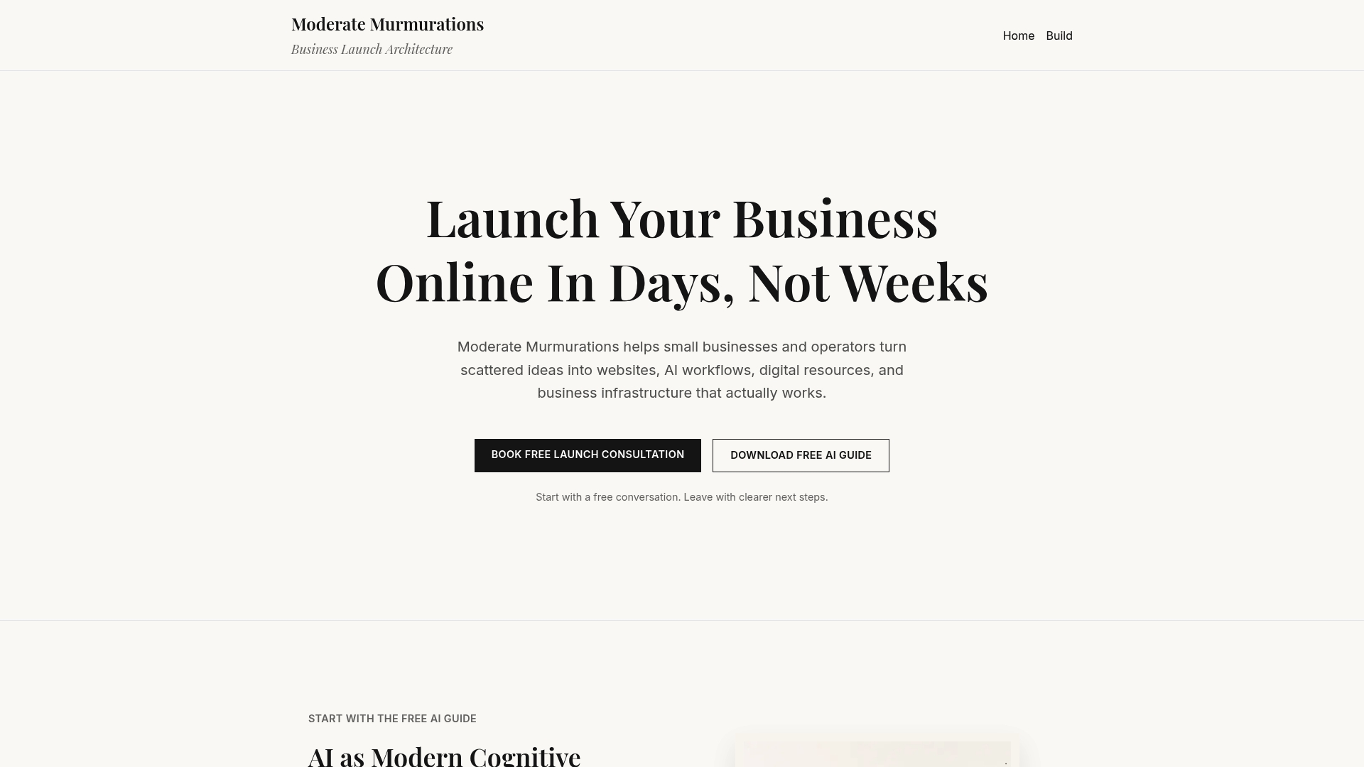
We handle the full build: a niche-focused homepage, case studies formatted the way prospects actually read them, and a scheduling flow that removes friction between “interested” and “booked.” Three things you get:
- A site live in days, not months
- Conversion-focused copy built around your actual results
- A booking flow ready to accept clients from day one
If your current site (or lack of one) is costing you clients, book a free consultation and we’ll map out exactly what your first version should include.
Where to Find More Consultant Site Examples and Tools
A few resources worth bookmarking as you build or refine your site:
- 29 Best Consultant Website Examples Worth Imitating — a solid starting gallery for screenshot-and-takeaway inspiration.
- Design portfolio examples on Webflow’s blog — useful for understanding narrative case-study formatting.
- Awwwards portfolio collection — deep visual inspiration if design is part of your value proposition.
- Personal brand case studies from The Artist Evolution — helpful if you’re building a solo, personality-driven brand.
- Free invoice templates for consultants — a practical add-on once your site starts bringing in bookings.
Sources
- 29 Best Consultant Website Examples Worth Imitating
- Design portfolio examples (Webflow blog)
- Best Portfolio Websites | Web Design Inspiration
- How to Build a Personal Brand as a Consultant in 2026 - Lilach Bullock